Value Streams Dashboard (ULTIMATE ALL)
- Introduced in GitLab 15.8 as a Closed Beta feature with a flag named
group_analytics_dashboards_page. Disabled by default.- Released in GitLab 15.11 as an Open Beta feature with a flag named
group_analytics_dashboards_page. Enabled by default.- Generally available in GitLab 16.0. Feature flag
group_analytics_dashboards_pageremoved.
To help us improve the Value Streams Dashboard, share feedback about your experience in this survey. For more information, see also the Value Stream Management category direction page.
The Value Streams Dashboard is a customizable dashboard you can use to identify trends, patterns, and opportunities for digital transformation improvements. The centralized UI in Value Streams Dashboard acts as the single source of truth (SSOT), where all stakeholders can access and view the same set of metrics that are relevant to the organization.
The Value Streams Dashboard includes the following metrics:
With the Value Streams Dashboard, you can:
- Track and compare the above metrics over a period of time.
- Identify downward trends early on.
- Understand security exposure.
- Drill down into individual projects or metrics to take actions for improvement.
The Value Streams Dashboard has a default configuration, but you can also customize the dashboard panels.
DevSecOps metrics comparison panel
The DevSecOps metrics comparison displays DORA4, vulnerability, and flow metrics for a group or project in the month-to-date, last month, the month before, and the past 180 days.
This visualization helps you get a high-level custom view over multiple DevOps metrics and understand whether they're improving month over month. You can compare the performance between groups, projects, and teams at a glance. This visualization helps you identify the teams and projects that are the largest value contributors, overperforming, or underperforming.
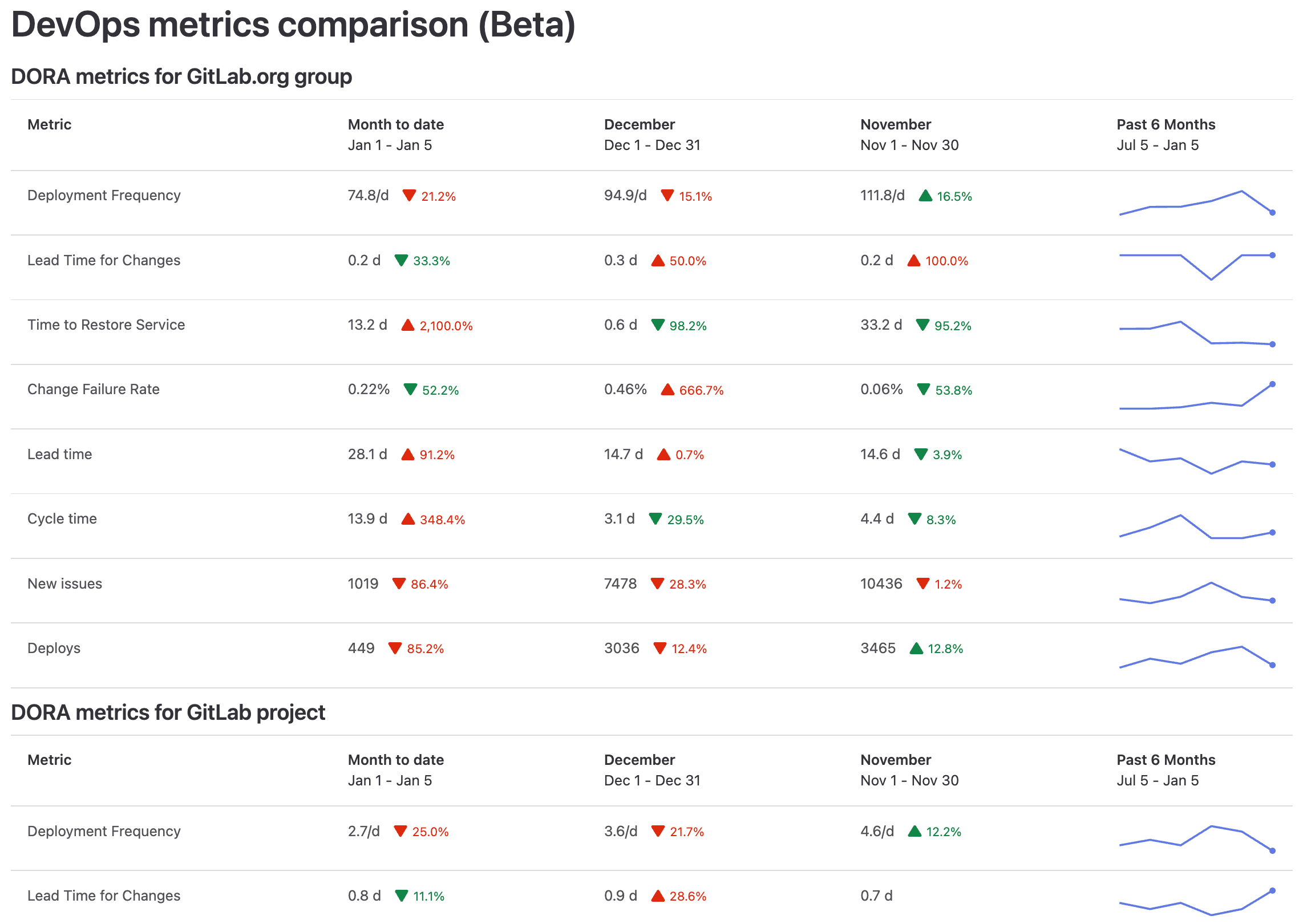
You can also drill down the metrics for further analysis. When you hover over a metric, a tooltip displays an explanation of the metric and a link to the related documentation page.
DORA Performers score panel
Introduced in GitLab 16.2 with a flag named
dora_performers_score_panel. Disabled by default.
FLAG:
By default this feature is not available. To make it available, an administrator can enable the feature flag named dora_performers_score_panel.
The DORA metrics Performers score panel is a bar chart that visualizes the status of the organization's DevOps performance levels across different projects.
The chart is a breakdown of your project's DORA scores, categorized as high, medium, or low. It aggregates all the child projects in the group.
Each bar on the chart displays the sum of total projects per score category, calculated monthly. To exclude data from the chart (for example, "Not Included"), in the legend select the series you want to exclude. Hovering over each bar reveals a dialog that explains the score's definition.
For example, if a project has a high score for Deployment Frequency (Velocity), it means that the project has one or more deploys to production per day.
| Metric | Description | High | Medium | Low |
|---|---|---|---|---|
| Deployment frequency | The number of deploys to production per day | ≥30 | 1-29 | <1 |
| Lead time for changes | The number of days to go from code committed to code successfully running in production | ≤7 | 8-29 | ≥30 |
| Time to restore service | The number of days to restore service when a service incident or a defect that impacts users occurs | ≤1 | 2-6 | ≥7 |
| Change failure rate | The percentage of changes to production resulted in degraded service | ≤15% | 16%-44% | ≥45% |
These scoring are based on Google's classifications in the DORA 2022 Accelerate State of DevOps Report.
Filter by project topics
When used in combination with a YAML configuration, you can filter the projects shown based on their assigned topics.
panels:
  - data:
      namespace: group/my-custom-group
      filter_project_topics:
        - JavaScript
        - Vue.js
If multiple topics are provided, all topics will need to match for the project to be included in the results.
Enable or disable overview background aggregation (ULTIMATE SELF)
- Introduced in GitLab 16.1 with a flag named
modify_value_stream_dashboard_settings. Disabled by default.- Enabled on self-managed in GitLab 16.4.
FLAG:
On self-managed GitLab, by default this feature is available. To hide the feature per project or for your entire instance, an administrator can disable the feature flag named modify_value_stream_dashboard_settings.
On GitLab.com, this feature is not available.
This feature is not ready for production use.
Prerequisites:
- You must have administrator access to the instance.
To enable or disable the overview count aggregation for the Value Streams Dashboard:
- On the left sidebar, select Search or go to and find your group.
- Select Settings > General.
- Expand Analytics.
- In Value Streams Dashboard, select or clear the Enable overview background aggregation for Value Streams Dashboard checkbox.
To retrieve aggregated usage counts in the group, use the GraphQL API.
View the value streams dashboard
Prerequisites:
- You must have at least the Reporter role for the group.
- Overview background aggregation for Value Streams Dashboards must be enabled.
To view the value streams dashboard:
-
From Analytics Dashboards:
- On the group left sidebar, select Search or go to and find your group.
- Select Analyze > Analytics Dashboards.
-
From Value Stream Analytics:
- On the left sidebar, select Search or go to and find your project or group.
- Select Analyze > Value stream analytics.
- Below the Filter results text box, in the Lifecycle metrics row, select Value Streams Dashboard / DORA.
- Optional. To open the new page, append this path
/analytics/dashboards/value_streams_dashboardto the group URL (for example,https://gitlab.com/groups/gitlab-org/-/analytics/dashboards/value_streams_dashboard).
You can also view the Value Streams Dashboard rendered as an analytics dashboard for a group or project.
Customize the dashboard panels
You can customize the Value Streams Dashboard and configure what subgroups and projects to include in the page.
Using query parameters
To display multiple subgroups and projects, specify their path as a URL parameter.
For example, the parameter query=gitlab-org/gitlab-ui,gitlab-org/plan-stage displays three separate panels, one each for the:
-
gitlab-orggroup -
gitlab-uiproject -
gitlab-org/plan-stagesubgroup
Using YAML configuration
To customize the default content of the page, you need to create a YAML configuration file in a project of your choice. In this file you can define various settings and parameters, such as title, description, and number of panels and labels filters. The file is schema-driven and managed with version control systems like Git. This enables tracking and maintaining a history of configuration changes, reverting to previous versions if necessary, and collaborating effectively with team members. Query parameters can still be used to override the YAML configuration.
First, you need to set up the project.
Prerequisites:
- You must have at least the Maintainer role for the group.
- On the left sidebar, select Search or go to and find your group.
- Select Settings > General.
- Expand Analytics.
- Select the project where you would like to store your YAML configuration file.
- Select Save changes.
After you have set up the project, set up the configuration file:
- On the left sidebar, select Search or go to and find your project.
- In the default branch, create the configuration file:
.gitlab/analytics/dashboards/value_streams/value_streams.yaml. - In the
value_streams.yamlconfiguration file, fill in the configuration options:
# title - Change the title of the Value Streams Dashboard. [optional]
title: 'Custom Dashboard title'

# description - Change the description of the Value Streams Dashboard. [optional]
description: 'Custom description'

# panels - List of panels that contain panel settings.
#   title - Change the title of the panel. [optional]
#   data.namespace - The Group or Project path to use for the chart panel.
#   data.exclude_metrics - Hide rows by metric ID from the chart panel.
#   data.filter_labels -
#     Only show results for data that matches the queried label(s). If multiple labels are provided,
#     only a single label needs to match for the data to be included in the results.
#     Compatible metrics (other metrics will be automatically excluded):
#       * lead_time
#       * cycle_time
#       * issues
#       * issues_completed
#       * merge_request_throughput
panels:
  - title: 'My Custom Project'
    data:
      namespace: group/my-custom-project
  - data:
      namespace: group/another-project
      filter_labels:
        - in_development
        - in_review
  - title: 'My Custom Group'
    data:
      namespace: group/my-custom-group
      exclude_metrics:
        - deployment_frequency
        - change_failure_rate
  - data:
      namespace: group/another-group
The following example has an option configuration for a panel for the my-group namespace:
panels:
  - data:
      namespace: my-group
For an overview of editing label filters in the configuration file, see GitLab Value Streams Dashboard - Label filters demo.
Label filters are appended as query parameters to the URL of the drill-down report of each eligible metric and automatically applied.
If the comparison panel from the configuration file is enabled with filter_labels, the drill-down links inherit the labels from the panel filter.
Dashboard metrics and drill-down reports
| Metric | Description | Drill-down report | Documentation page | ID |
|---|---|---|---|---|
| Deployment frequency | Average number of deployments to production per day. This metric measures how often value is delivered to end users. | Deployment frequency tab | Deployment frequency | deployment_frequency |
| Lead time for changes | The time to successfully deliver a commit into production. This metric reflects the efficiency of CI/CD pipelines. | Lead time tab | Lead time for changes | lead_time_for_changes |
| Time to restore service | The time it takes an organization to recover from a failure in production. | Time to restore service tab | Time to restore service | time_to_restore_service |
| Change failure rate | Percentage of deployments that cause an incident in production. | Change failure rate tab | Change failure rate | change_failure_rate |
| Lead time | Median time from issue created to issue closed. | Value Stream Analytics | View the lead time and cycle time for issues | lead_time |
| Cycle time | Median time from the earliest commit of a linked issue's merge request to when that issue is closed. | VSA overview | View the lead time and cycle time for issues | cycle_time |
| Issues created | Number of new issues created. | Issue Analytics | Issue analytics for projects and for groups | issues |
| Issues closed | Number of issues closed by month. | Value Stream Analytics | Value Stream Analytics | issues_completed |
| Number of deploys | Total number of deploys to production. | Merge Request Analytics | Merge request analytics | deploys |
| Merge request throughput | The number of merge requests merged by month. | Groups Productivity analytics, Projects Merge Request Analytics | Groups Productivity analytics Projects Merge request analytics | merge_request_throughput |
| Critical vulnerabilities over time | Critical vulnerabilities over time in project or group | Vulnerability report | Vulnerability report | vulnerability_critical |
| High vulnerabilities over time | High vulnerabilities over time in project or group | Vulnerability report | Vulnerability report | vulnerability_high |
Value Streams Dashboard metrics with Jira
The following metrics do not depend on using Jira:
- DORA Deployment frequency
- DORA Lead time for changes
- Number of deploys
- Merge request throughput
- Vulnerabilities